Blogs about web-development
Keyboard Shortcuts for Web Dev Tools Inspector and Console.
12.7.2017
Sometimes, right clicking on something in a browser and picking "Inspect" from the context menu just isn't fast enough for me. I wanted to find a way to quickly open the Inspector and Console tabs in a browser's web developer tools, so naturally I turned to keyboard shortcuts. I've compiled a reference of the commands for Firefox and Chrome here.
Firefox:
- Inspector: Ctrl Shift c (Cmd Option c on OSX)
- Console: Ctrl Shift k (Cmd Option k on OSX)
Even better, the Web Dev tools will open up - with the last active tab - when you hit your F12 key. (In OSX, use fn F12 if you haven't enabled the "Use all F1, F2, etc keys as standard function keys" Keyboard Preference.)
Chrome:
- Inspector: Chrome doesn't have a keyboard shortcut specific to "Elements" (Inspector), but Ctrl Shift i (Cmd Option i on OSX) will open the most recently used tab, just like F12.
- Console: Ctrl Shift j (Cmd Option j on OSX)
The DL Element.
11.14.2017
At a conference earlier this year, I was asked what my favorite HTML element was. In fact, I do have one: the Definition List, along with its children Definition Term and Definition Description. The definition list is great because it provides an inherent semantic relationship between two elements - the term and the one or more descriptions. I feel like these elements are under-used; especially considering that they've been around since HTML 4.01.
I was going to invent a clever example to demonstrate the definition list, but I don't think I can do any better than the one provided by the Mozilla Developer Network:
- Firefox
- A free, open source, cross-platform, graphical web browser developed by the Mozilla Corporation and hundreds of volunteers.
- The Red Panda also known as the Lesser Panda, Wah, Bear Cat or Firefox, is a mostly herbivorous mammal, slightly larger than a domestic cat (60 cm long).
Here is the source code for that:
- Firefox
- A free, open source, cross-platform, graphical web browser developed by the Mozilla Corporation and hundreds of volunteers.
- The Red Panda also known as the Lesser Panda, Wah, Bear Cat or Firefox, is a mostly herbivorous mammal, slightly larger than a domestic cat (60 cm long).
This shows one term (Firefox) along with two definitions of that term. Because it's a list, you can add as many groups of terms and definitions as needed for your content.
Spinning Up a New GitHub Pages Site.
9.11.2017
Pages might just be one of my favorite things about GitHub. Though I often use them for lists of links to go along with my presentations, they are capable of much more complex static sites.
Here is a quick reminder of how to set up a new GitHub Pages site:
- Create a new repo on GitHub.
- Don't create any new files yet, even licenses or readmes. If you have already created files, then stash them.
- Clone that repo locally and check out a new
gh-pages branch (git checkout -b gh-pages).
-
Pop any files you've stashed. Add any other files you want in your repo.
- Commit the changes, and then push the
gh-pages branch up to Github.
You're done! You can now view your new page at https://[your-user-name].github.io/[your-repo-name]/.
If you have somehow ended up with a master branch with commits, you can remove it thusly:
- On the GitHub site, make the gh-pages branch the default.
- Delete the master branch both on the GitHub site and locally.
6.6.2017
Currently, orphans and widows aren't supported unless you're working inside paged media or columns. Phooey on that - I've got a few use cases where it would be nice to use it in other contexts.
Multiline Headline.
Here is a multiline headline inside an element whose width leaves just one word on the bottom line:  It would be nice if a declaration of
 orphans: 4; on the headline caused the browser to reflow the text so that 4 was the minimum number of words remaining in the bottom line of the paragraph.
Flexbox.
Here is a group of images arranged with flexbox, and just one lonely element stretched at the bottom of the group: 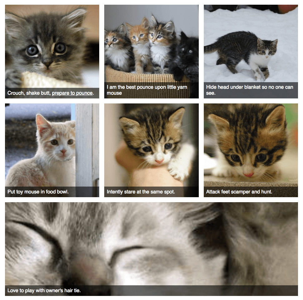 It would be nice if a declaration of
 orphans: 2; on the flexboxed element caused the browser to try its best to arrange the child elements so that 2 was the fewest number of children at the bottom row.
Print vs. Online Products.
2.2.2017
Let us take a little time to compare and contrast printed products with their online counterparts - such as a printed newspaper and the same newspaper's website.
The printed version is tangible and tactile. Once printed, it can't be revised by the creator, though the user can make notes on the paper. Since it's a tangle product, the user must find a way to dispose of the used product; which may be repurposed as combustion or packing material. Each newspaper will probably only be used by one or two users.
The online version is interactive: searchable and sharable. It is easily updated. The website is much more likely to be seen by users outside of the physical area of the newspaper. Many users will use the same "version" of the paper, which can generate comments and discussions.
These are completely different products, even though they share the same content.
More blogs about web-development:
-
The Firefox Command Line. — 9.14.2015
-
Vertical Centering is Solved. — 1.26.2015
-
CSS Hacks. — 6.21.2014
-
CSS Magic - border-box. — 5.26.2014
-
Environment Syncing for Sublime Text 3. — 4.25.2014
-
Quick Notes from Cascadia JS 2013. — 12.27.2013
-
CSS for Variable Height Elements in a Grid. — 12.16.2013
-
File Generators. — 12.6.2013
-
A Persistent Case of Mis-Identification. — 11.18.2013
-
ST Logging Keyboard Commands. — 10.19.2013
-
CSS Magic: Containing floats (clear-fixing) with overflow: auto;. — 10.7.2013
-
CSS3 Generators. — 7.9.2013
-
Quick and Dirty Mobile Friendly Updates. — 4.24.2013
-
Another 3 Books for Web Developers. — 4.6.2013
-
Three Must-Read Books for Web Developers. — 3.28.2013
-
PHP Current Year. — 3.5.2013
-
HTML5 Default Types. — 1.16.2013
-
10 Things I Love About Sublime Text 2. — 12.23.2012
-
Quick and Dirty Vertical Centering for Headers. — 11.9.2012
-
A jQuery Demo - Show, Hide and Toggle. — 10.3.2012
-
Firefox's Scratchpad. — 12.8.2011
-
Quick And Easy CSS Targeting. — 1.11.2011
-
Browser Support. — 4.7.2010
-
Drupal Tricks for Dummies. — 6.7.2009
-
Firefox - Zoom Text Only. — 6.3.2009
-
Smooth Animation Using jQuery's slideToggle() - Details. — 5.6.2009
-
(Not Quite) PNG-Tastic! — 4.29.2007
-
Free At Last. — 4.26.2007
-
It's called "Pro Bono". — 1.24.2007
-
Wii The Eff? — 1.23.2007
-
Web Devloper Extension. — 6.22.2006
 It would be nice if a declaration of
  It would be nice if a declaration of
